Akriti for the classroom
Teach topological data analysis without the setup tax.
A free, open teaching pack for instructors of TDA — undergraduate or graduate, mathematics or applied. Pre-built notebooks open in the browser. No installation. No environment debugging. No teaching-assistant office hours spent on pip errors.
Pilot lesson
Lesson 1 — Detecting cycles in noisy data.
A 45-minute lesson for an undergraduate or beginning-graduate audience. Students learn to read a persistence diagram by computing one for two visually similar datasets that differ topologically: a noisy circle and a noisy Gaussian blob.
Learning objectives
By the end of this lesson, students should be able to:
- Compute a persistence diagram from a 2-D point cloud.
- Identify H₀ (component) and H₁ (cycle) features in the diagram.
- Distinguish topological signal from noise by reading feature persistence.
- Explain why two visually different point clouds can produce the same diagram.
Setup
Students open the Colab notebook. The first cell imports a thin teaching wrapper around the Akriti API:
# Today: a small teaching shim over GUDHI; from August 2026: real Akriti.
from akriti_teach import sample_circle, sample_blob
from akriti_teach import persistence, plot_pointcloud, plot_diagram
Step 1 — Two datasets that look similar
Generate two point clouds, each with 180 noisy points scattered in the unit square:
circle = sample_circle(n=180, noise=0.06)
blob   = sample_blob(n=180, scale=0.5)

plot_pointcloud(circle)
plot_pointcloud(blob)
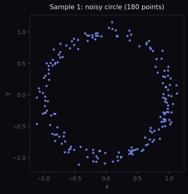
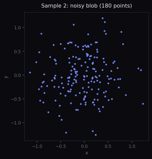
Discussion prompt for students: visually, both datasets have a similar number of points and similar overall extent. What feature distinguishes them? Can a point-by-point summary statistic capture that feature?
Step 2 — Compute persistence
Run the same one-line call on each dataset:
circle_diagram = persistence(circle)
blob_diagram   = persistence(blob)

plot_diagram(circle_diagram)
plot_diagram(blob_diagram)
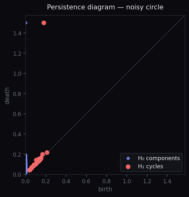
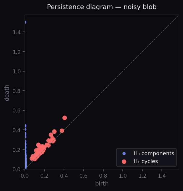
Step 3 — Read the diagrams
The horizontal axis is the birth of a feature — the radius at which it first appears as the filtration grows. The vertical axis is its death. The vertical distance from the diagonal is the feature's persistence: how long it lives.
In the circle's diagram, one red H₁ point sits far above the diagonal — that's the cycle around the circle, and it persists across a wide range of scales. In the blob's diagram, every feature dies almost immediately after birth — they are noise.
The key insight: visually similar point clouds can have radically different topology, and persistence is the tool that distinguishes signal from noise.
Step 4 — Exercises (15 min)
- Generate
two_circles = sample_two_circles(n=240, separation=3.0). Plot it. Predict its persistence diagram. Compute it. Were you right? - Reduce the circle's noise to
noise=0.01. How does the H₁ feature's persistence change? What aboutnoise=0.20? - Reduce the circle's sample count to
n=30. Does the H₁ feature still appear? At what sample count does it disappear? - Take a Swiss-roll dataset (
sample_swiss_roll()). Predict and verify its diagram.
Discussion questions for the next class
- What assumption does our analysis make about the density of the sampling? When does it break?
- If two datasets have identical persistence diagrams, must they be topologically equivalent? (Hint: think about a circle versus a figure-eight.)
- How would you decide what counts as a "significant" feature? Akriti picks a threshold automatically — but what if you had to choose?
- Colab notebook (Python, executable)
- Beamer slide deck (LaTeX source + PDF)
- Solutions to all four exercises
- One-page instructor's guide
- Three reference datasets
Available now on request. The full six-lesson pack ships with Akriti v0.0.1 in August 2026.
More lessons coming
A six-lesson arc, shipping with v0.0.1.
Are you teaching a TDA course (or thinking about it)? Get in touch — we'll prioritise the lessons your syllabus needs and notify you when each lands.